Paludan Bogcafé — Copenhagen, Denmark
Brand Identity Design
Paludan Bogcafé is the oldest book-cafe in Denmark and an iconic piece of cultural history, frequented by students, business professionals, regulars, and tourists alike. Pauldan created a legacy for itself through their service of books for local København University students & warm food for residents of the neighboring old Jewish quarter of Copenhagen.
The decision to redesign, rebrand, and modernize Paludan comes as the street grows into a hotspot of tourism and activity. The café’s clear objective is to “combine the traditional bookstore with a functioning eatery, where service is top notch in both places”. This redesign of Paludan’s visual identity aims to preserve the history, legacy, and antique feel of the original bookstore, while also modernizing, decluttering, and streamlining the overall brand to make it feel more welcoming to a newer, younger generation of customers.
Visual Identity Breakdown: The design choices for this new identity were not made lightly or superficially, but rather carried a great deal of deep thought, consideration, and intentionality for preserving Paludan’s historical and cultural legacy. As one of the world’s oldest bookcafes, Paludan is rich in history, so it was only right that the new identity system reflected this and was also rich in meaning & symbolism.

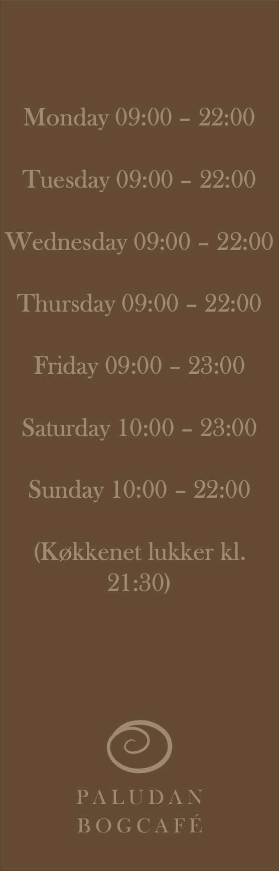
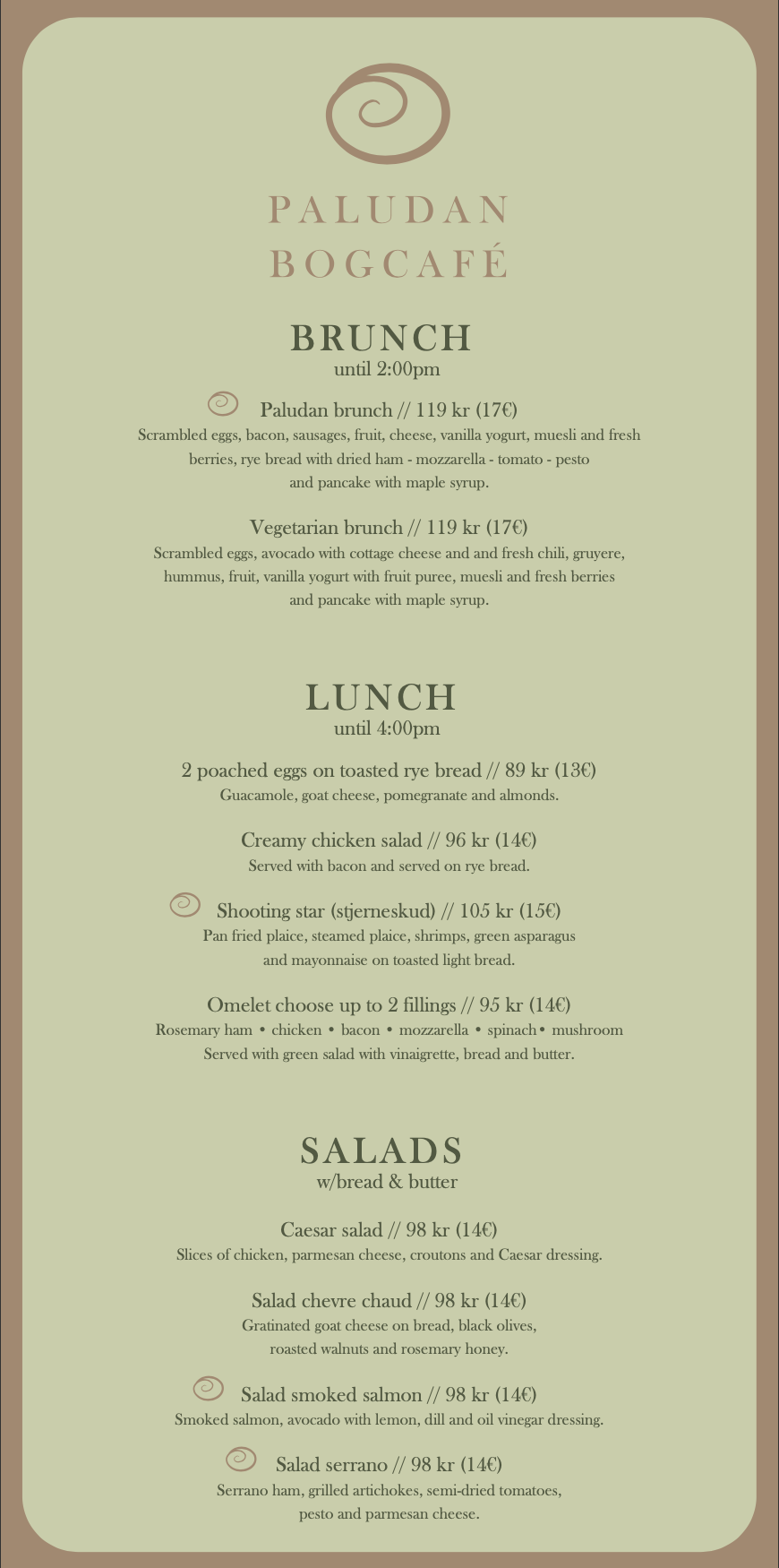
Double-Sided Bogcafé Menu (Front & Back): Alongside the vast bookstore, Paludan also serves a wide array of dishes from their café, along with a daily variety of fresh-made artisanal pastries not listed on the regular menu. In contrast to the existing menus, the redesign features a cohesive color scheme that is unique & recognizable to the new visual identity of Paludan where the de-saturated colors prevent clashing with the content while the typeface selection of Baskerville Old Face provides an elegant yet understated tone to the menu. The reorganized format aids in conveying a large amount of content to customers by utilizing negative space so that the blocks of text aren’t overwhelming & overcrowded.


Double-sided Bookmarks/Business Cards (Fronts & Backs): An additional deliverable of the brand are complementary bookmarks from the bookstore portion of the bogcafé that double as business cards. The simple & succinct designs focus on the base graphic elements of Paludan’s visual identity — logo, type, and color, which serve to further strengthen the new identity system.